
") | |
| Travel time to major cities (in hours and days) and shipping lane density |

This map is made by Canadian researchers Aaron van Donkelaar and Randall Martin at Dalhousie University, Halifax, Nova Scotia, Canada, created the map by blending total-column aerosol amount measurements from two NASA satellite instruments with information about the vertical distribution of aerosols from a computer model., http://www.nasa.gov/topics/earth/features/health-sapping.html The map shows the concentration of pollutions globally. I found this map interesting because the air pollution is not only limited to developing countries. Sahara desert has severe pollution because the winds will blow up large amount of the mineral particle which will cause air pollutions. As India and China has their pollutions by directly releasing burned coal waste from factories and power plants
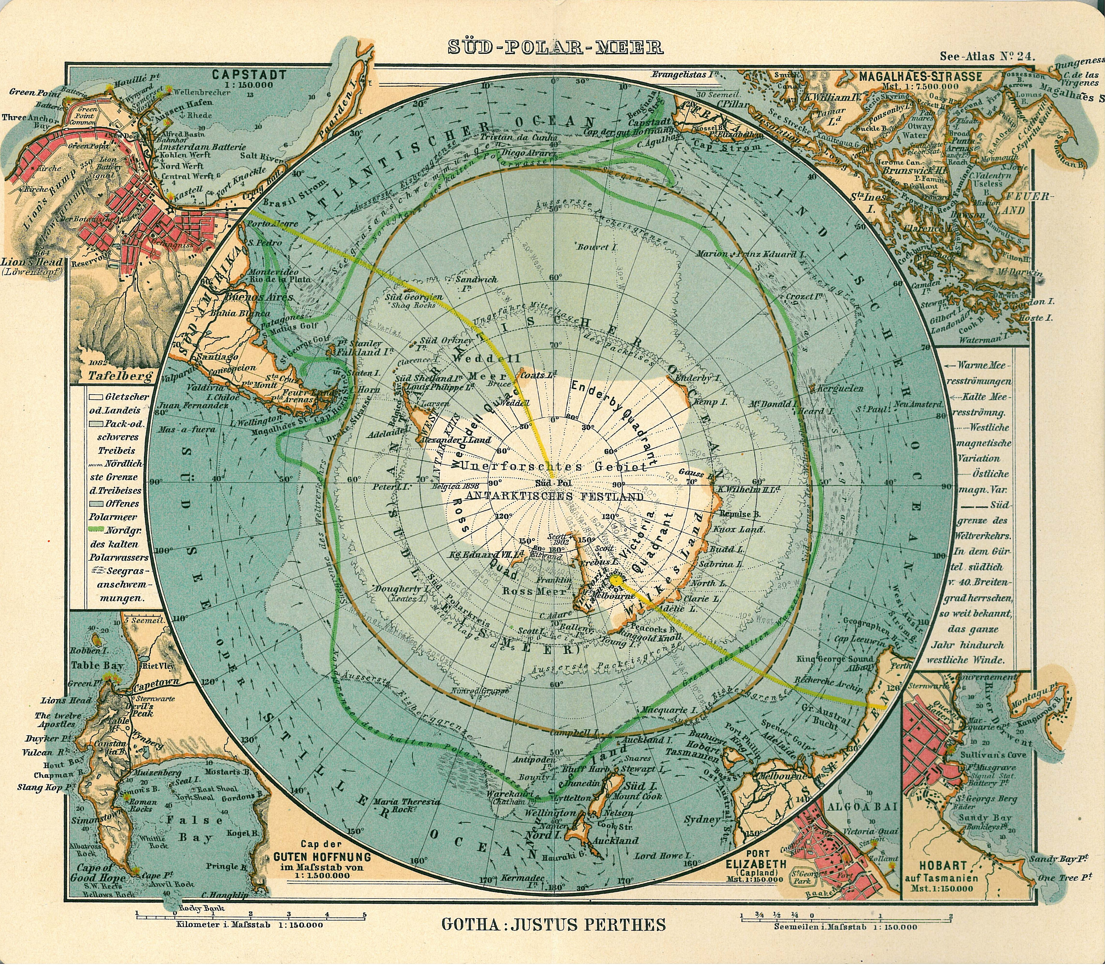
This is a map is from 1906 Atlas by Justhus perthes portraiting the world from direct view from top of the Antarctica. http://en.wikipedia.org/wiki/File:Antarctica_map.jpg . I find this map particularly interesting because usually the map we use are horizontally scroll out facing the equator. usually these maps have lands size proportionally distorted. and this map with view of globe on from the top of Antarcica will show the true size of antica comparing with other continent and a true shape of what Antarctica looks like.
No comments:
Post a Comment