Wednesday, April 25, 2012
Digital Mapping of Reyner Banham's Documentary "Reyner Banham Loves Los Angeles"
View Beyner Banham loves Los Angeles in a larger map
Neogeography is the modern mapping tool which is very user friendly to beginners who try to make some maps for themself. This tool has great potentials in modern world to extend its functions and services to help geographers or anyone who is interested in making maps. There are some great advantages and potentials in one of the Neogeography application, Google Maps. First, the user interface for the application is simple and straight forward. The user friendly interface welcomes anyone who is trying to use it. Various funationalities are also one of Google Maps's advantage. Although the interface is simple, Google Maps got all the tools which u need to make your map complete and interesting to read. The basic points, lines and polygon shapes are there to help u to make your map clear and easy to understand. different symbols for the points make the map iteresting to read and easy to understand. Google map also allow users to edit or add text, pictures or videos to describe the points or the polygons that are on the map. Finally, you can share your own map, which can be made for any purpose, online and show it to public.
However, there are some disavantages and pitfalls of using Google Maps to create maps. This map making is totally depending on the basic terrain map which is provided by Google. You will not able to edit ur legend, adding new streets or places which are not yet updated by Google. The basic terrain map ignores elevation making and UTM projections. This overly simplified map is not suitable for more formal map makings. Overall, I think the Google Maps got more potentials and upsides than the disavantages that it have. This tool is great for beginners or amatures to start learning how to make maps. The social tools, that Google Maps have, allow people to share their own map, and will promote enthusiasm in map making in our society. Mapping making is no longer only for the professional geographers.
Thursday, April 19, 2012
The Beverley Hills Map Study
It is the
Beverly Hills quadrangle.
There are Canoga
Park, Van Nuys, Burbank, Topanga, Hollywood, Venice, and Inglewood.
This quadrangle
is first created in 1966.
There are North
America Datum of 1927, North America Datum of 1983, and National Geodetic
Vertical Datum of 1929.
The unit less
scale is 1:24000, which in units of cm, 1(cm):24000(cm), 1cm on the map is 240
meters on earth. And 1(inch):24000(inches), 1 inch on the map is 2000 feet on
earth, also is 0.38 miles on the ground.
C. one mile on the ground
is 2.64 inches on the map.
D. three kilometers
(3000meters=300000cm) is 12.5 cm on the map.
The contour
interval is 20 on the map.
B. 118 degree 30 minutes 5
seconds, 118.5013 degree east longitude, 34 degree 0 minutes 30 seconds,
34.0083 degree north latitude .
C. 118 degree 24 minutes 0
seconds, 118.4000 degree east longitude, 34 degree 7 minutes 00 seconds, 34.1167
degree north latitude.
A.
About 560 feet, 170.688 meters
B.
About 160 feet, 50 meters
C.
About 600 feet, 183 meters
It is zone 11
3763 North, 3762East
1 12) How Many square meters
are contained within each square of UTM gridline.
About 1000000 meters square
1 13) Obtain Elevation
measurements, from west to east
Elevation for every 500 meters (feet)
|
UTM east coordinates
|
500
|
362000
|
600
|
363000
|
600
|
364000
|
500
|
365000
|
480
|
Beginning of UCLA East Campus
|
480
|
366000
|
460
|
367000
|
440
|
End of UCLA at east campus
|
420
|
368000
|
350
|
369000
|
300
|
370000
|
250
|
371000
|
190
|
372000
|

14) The declination is 14 degree east.
15)The water flows from North
to South
1 16)

1 16)
Friday, April 6, 2012
Interesting Maps

") | |
| Travel time to major cities (in hours and days) and shipping lane density |

This map is made by Canadian researchers Aaron van Donkelaar and Randall Martin at Dalhousie University, Halifax, Nova Scotia, Canada, created the map by blending total-column aerosol amount measurements from two NASA satellite instruments with information about the vertical distribution of aerosols from a computer model., http://www.nasa.gov/topics/earth/features/health-sapping.html The map shows the concentration of pollutions globally. I found this map interesting because the air pollution is not only limited to developing countries. Sahara desert has severe pollution because the winds will blow up large amount of the mineral particle which will cause air pollutions. As India and China has their pollutions by directly releasing burned coal waste from factories and power plants
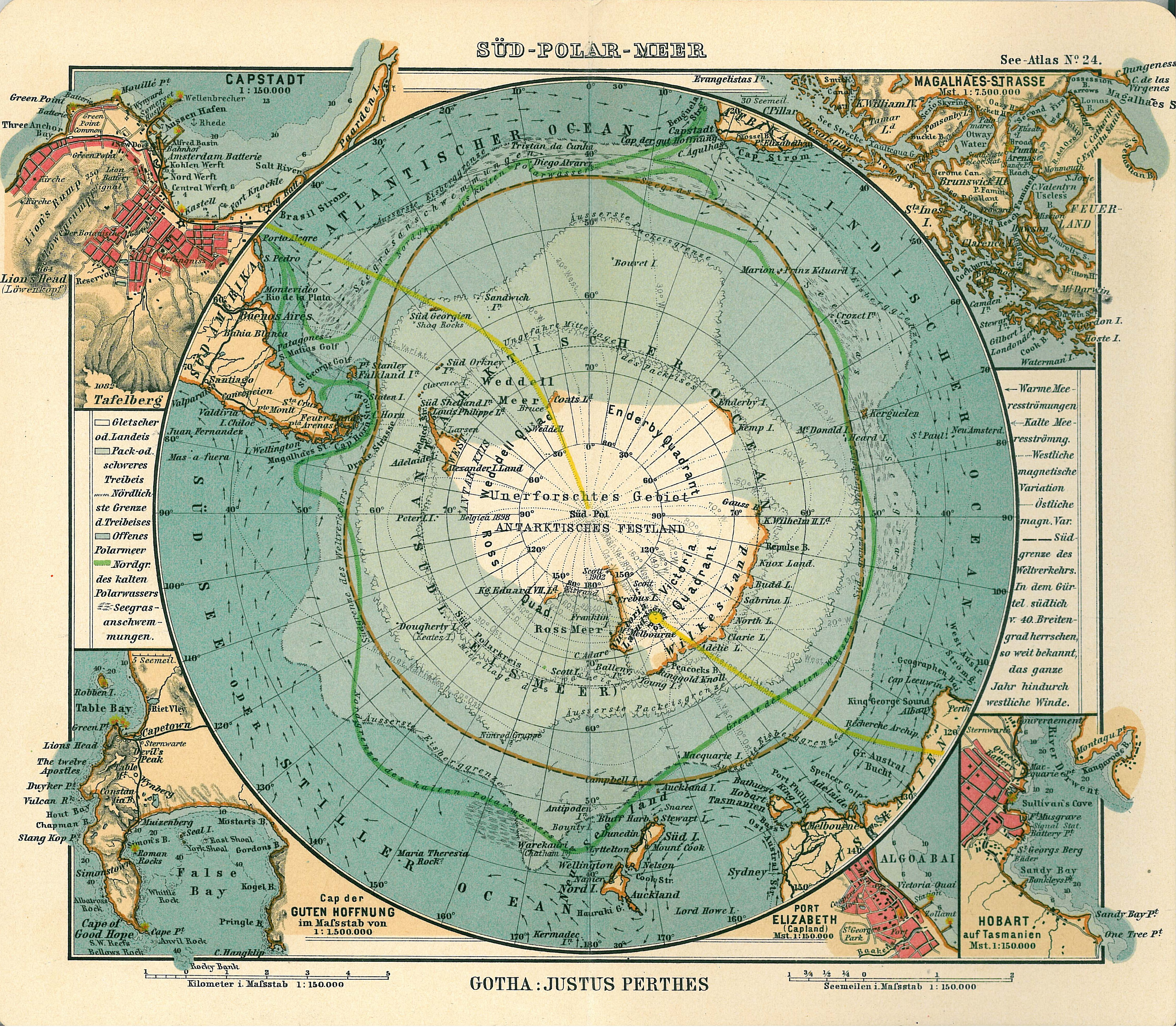
This is a map is from 1906 Atlas by Justhus perthes portraiting the world from direct view from top of the Antarctica. http://en.wikipedia.org/wiki/File:Antarctica_map.jpg . I find this map particularly interesting because usually the map we use are horizontally scroll out facing the equator. usually these maps have lands size proportionally distorted. and this map with view of globe on from the top of Antarcica will show the true size of antica comparing with other continent and a true shape of what Antarctica looks like.
Subscribe to:
Comments (Atom)